B
How Exhibition Stand Layout Affects Visitor Flow
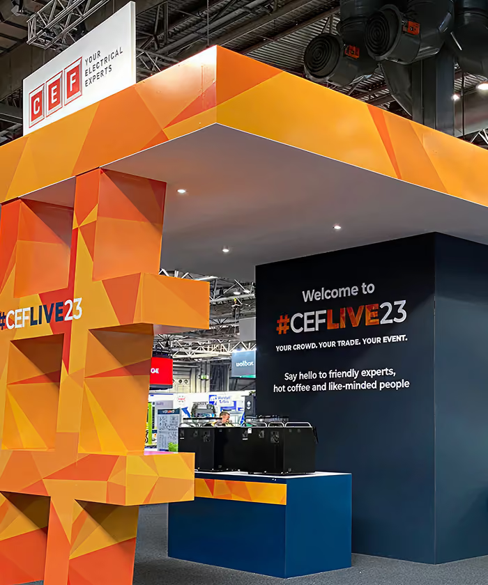
Two stands of the same size, at the same show, on the same budget, can give you wildly different results. One fills with visitors who stay, talk and leave their details. The other watches people drift past, or step on, glance around and step straight off again. The difference is rarely the graphics or the giveaways. It's the layout, and specifically how that layout moves people through the space.
Visitor flow is one of those things that feels invisible when it's working and painfully obvious when it isn't. Get it right and people move through your stand the way you'd hoped, pausing where you want them to pause and ending up in conversation with your team. Get it wrong and you spend the show wondering why a stand that looked great in the renders feels so quiet. Here's what actually drives it.
Openness Decides Who Steps On
The first job of your layout is to remove the barrier to entry. A stand with a counter across its front edge, or walls closing off two sides, tells passing visitors that stepping on is a commitment. Most of them won't make it.
Keep the Entrance Clear
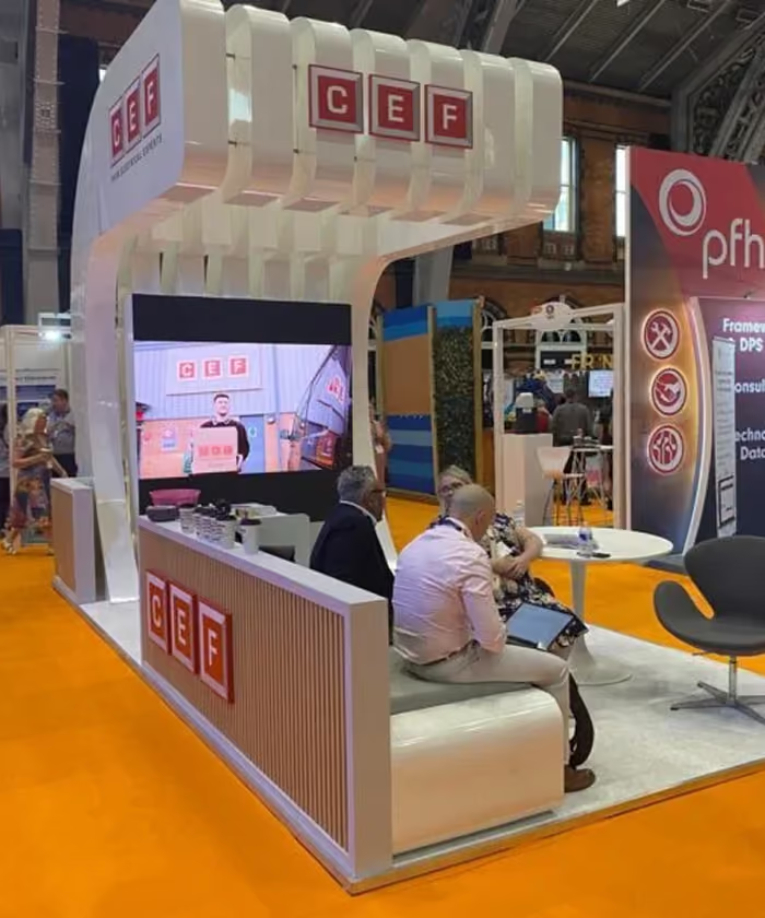
Open layouts work because they let people drift in without really deciding to. Give yourself an entrance width of at least a third of the stand's frontage, keep sightlines running through to the back, and don't block the approach with furniture. The visitors who wander on without a conscious decision are exactly the ones you'd never have caught with a closed design.
Use Your Open Sides
Your aisle position matters here too. If you've got a corner or peninsula plot, you have two or more open sides, which multiplies your natural entry points. If you're inline with a single open edge, that edge has to work harder, which usually means keeping it completely clear and using height and lighting to pull people in from further down the aisle.
People Turn Right, So Plan For It
Visitor behaviour on stands follows patterns that show up again and again. Most people entering a space drift to the right. They slow down at corners. They avoid dead ends and hesitate before narrow gaps. None of it is conscious, and all of it is predictable, which means you can work with it rather than against it.
Design With the Instincts, Not Against Them
This is where the psychology of exhibition stand design really earns its keep. Put your strongest product display on the right-hand path, position staff at natural pause points rather than at the entrance, and give the eye a clear destination at the back of the stand, and you turn those instincts into engagement. A layout that fights them, however good it looks in a render, will underperform on the floor.
Give Your Team the Right Position
There's a knock-on benefit here too. When people move through a stand in a predictable direction, your team can position themselves to catch visitors at the right moment, after they've had a chance to look but before they lose interest. A layout with no obvious flow leaves your staff guessing where to stand, and that hesitation shows.
Zones Give Visitors Somewhere to Go
A stand without zones is just a room people stand in awkwardly. A zoned stand gives every type of visitor a place to be, and that keeps them on it for longer.
The most reliable structure runs from public to private. An open browsing area at the front lets casual visitors engage without being pounced on. A demonstration or display zone in the middle gives interested prospects a reason to move deeper. Seating or a meeting space towards the back gives your serious conversations somewhere to happen away from the aisle noise. Storage sits hidden behind it all, because boxes of brochures stacked in view undo a premium build in seconds.
Give the Zones Room to Breathe
Your zones need breathing room between them. If you cram four functions into a 4x4 plot, you'll end up with a stand where every conversation blocks a walkway. On a smaller plot, do two zones well rather than four badly. It's better to have a clear browsing area and one good meeting spot than a cramped attempt at everything.
Congestion Reads as Failure, Even When It's Success
There's an irony in stand design: too much success in one spot kills the rest of your space. A brilliant demo that draws a crowd at the entrance forms a wall of backs, and passing visitors read a blocked stand as a full one. So they walk on.
Position your crowd-pullers, whether that's a live demo, a screen or a coffee machine, deep enough into the stand that the audience gathers inside the space rather than across its mouth. The queue becomes part of the theatre, and your entrance stays open for the next wave.
Spread Your Staff Out
Staff placement follows the same logic. A cluster of your team chatting near the front edge is one of the most effective visitor repellents at any show. Spread them through the zones, facing outwards, each with a clear sense of which zone they own. A visitor who catches a member of staff mid-conversation with a colleague is far less likely to interrupt than one greeted by someone clearly ready to talk.
Sightlines Do the Selling Before You Do
Visitors decide whether your stand is worth their time from ten metres away, mid-stride, in about two seconds. Your layout controls what they see in that window. A raised rear wall with your core message at a readable height, an uncluttered line of sight from aisle to focal point, and lighting that pulls the eye to the things that matter will win that two-second judgement far more often than sheer density of content.
Make Height and Light Work
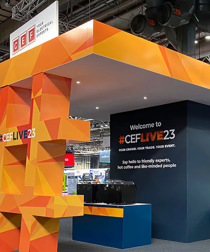
Height is underused here. In a hall of 2.5-metre shell schemes, a four-metre structure is visible from three aisles away and pulls in traffic you were never positioned to receive. If your budget allows for height anywhere, put it into a strong overhead sign or a raised rear element that carries your name across the hall.
Lighting does similar work at close range. A stand lit evenly reads as flat, while one with brighter pools over the products and displays you care about guides the eye exactly where you want it. Visitors follow light without realising they're doing it.
Test the Flow Before You Build It
Every stand we design gets walked before it gets built. We trace the routes a visitor would take from each open edge, work out where conversations will physically happen and check that no single busy moment can choke the space. It's a discipline that's come from sixteen years of watching real stands work, and it's the difference between a layout that photographs well and one that fills your pipeline. If you've got a plot booked and a floor plan in hand, send it over and we'll tell you what the space can do.