B
7 Exhibition Stand Design Tips for Maximum Visibility
You've got the floor plan, the space is booked, and fairly soon someone is going to ask you what you want the stand to look like. The temptation is to answer that question by picturing a visitor standing directly in front of it. Most of the value in your floor space, though, comes from the people who are forty metres away and had no intention of visiting you at all.
Being seen on a busy show floor is a design problem with some well understood solutions. Here are seven that make the biggest difference to how many people notice you before they walk past.
Build Upwards Before You Build Outwards
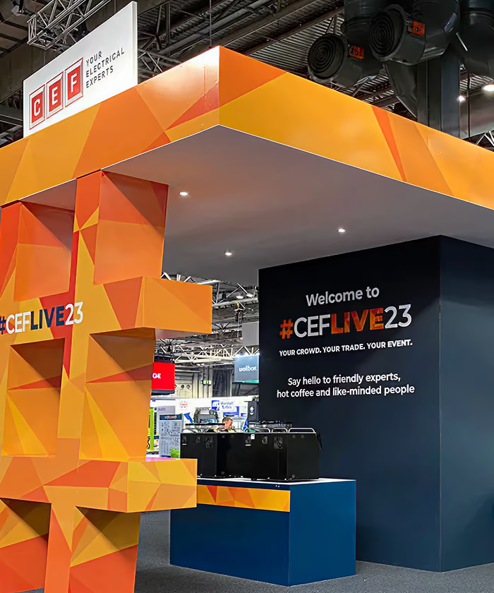
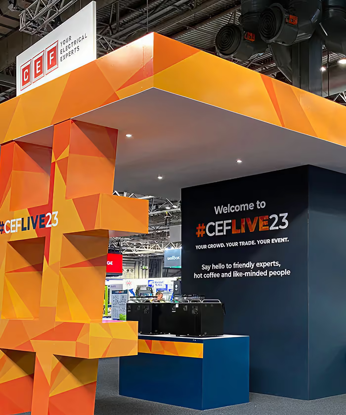
Height is the cheapest visibility you can buy. A three by three stand with a tower or a raised graphic band will do more for you than a six by three flat wall, because everything below about two metres disappears behind other visitors as soon as the aisles fill up. Check the organiser's height regulations early, since they vary between venues and often between hall zones within the same venue.
If the rules allow a hanging banner, take it. A rigged sign above your stand gives people a fixed point they can find from the other side of the hall, and it carries on working at the busiest part of the day when your ground level graphics are hidden by crowds. Double sided is worth paying for, because half your audience approaches from the other direction.
Give The Stand One Clear Message
Visitors read your stand at walking pace, which gives you roughly three seconds and about five words. Your company name and a short line about what you actually do will earn far more attention than a wall listing every product in the catalogue. Everything else belongs on the second layer, on screens, on printed material and in what your team says once someone has stopped.
Plenty of exhibition stand psychology comes back to this moment. People decide whether to approach based on whether they can work out what you do without asking, and a stand that makes them guess loses them to the one next door. Write the headline first, then design around it.
Light Your Own Stand
Hall lighting is flat and grey, and it's specified for the building itself. Any stand carrying its own lighting rig looks brighter and better finished than its neighbours, and the difference shows up immediately in photographs your marketing team will want afterwards.
Start by washing your main graphic wall evenly so the brand colours hold their strength. Add spots on whatever you want people to look at, which is usually a product or the counter. Backlit graphics and lit counters pull attention from a long way down the aisle, and they cost a good deal less than three extra square metres of floor space would.
Keep The Front Edge Open
A counter running across the front of your stand asks visitors to stop and talk to a stranger before they've seen anything worth stopping for. Most of them keep walking. Set that counter back, angle it, or move it to one side so there's an obvious route in.
Corner plots give you two open sides and usually justify the premium the organiser charges for them. On an inline plot, treat the aisle edge as a doorway. Flooring that changes colour at the boundary and a lighting line overhead will both tell people they're allowed to walk in.
Use Colour That Holds Up At Distance
Two strong colours with real contrast between them will carry much further than a subtle palette of five. Distance flattens everything, so mid tones blur into the general grey of the hall while blocks of saturated colour keep their shape.
Your brand guidelines were probably written for screen and print, where fine gradients and tonal variation work beautifully. Ask your designer to pull the strongest colours out of that set and use them at scale across large flat areas. Keep your logo on a plain background too, because busy photography behind a logo destroys it at anything over ten metres.
Put Movement At Eye Level
Peripheral vision picks up motion long before it picks up detail, which is why a screen playing video catches people who never consciously looked your way. Position that movement between about 1.4 and 1.8 metres off the floor, in the natural eye line of someone walking past, and keep the content simple enough to follow without sound.
Live demonstrations do the same job and do it better, because a small crowd is the strongest signal on any show floor. Give your team a defined place to stand and present that's visible from the aisle, and run demos to a published timetable so visitors have a reason to come back.
Design The Approach As Well As The Frontage
Walk the floor plan before you sign off the design. Look at which direction the main flow arrives from, where the entrances and catering sit, and what your stand looks like at a forty five degree angle from up the aisle, because almost nobody ever sees it straight on.
Side returns matter more than most exhibitors expect. A blank panel facing the busiest approach is wasted space, and a graphic in that position is often seen by more people than your main wall. The same goes for the back of a tower or any structure that's visible above the neighbouring stands.
Getting It Built
IMA Solutions designs, fabricates and installs exhibition stands with an in-house team, so the person drawing your lighting plan works alongside the people who build the set and rig it on site. Send us your floor plan and your show dates, and we'll come back with a design that's already been checked against the organiser's regulations.