B
8 Common Exhibition Stand Design Mistakes: How to Avoid Them
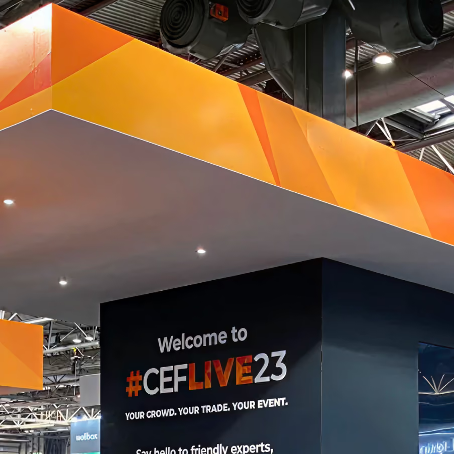
A poor exhibition stand rarely fails for one dramatic reason. It fails through a handful of small design decisions that each seemed sensible on their own and added up to a space people walk past. The good news is that the same mistakes show up show after show, which means once you know what they are, they're easy to design out. Most of them come down to ignoring a few exhibition stand design best practices that experienced builders treat as standard. Here are the eight we see most often.
1. Forgetting Who the Stand Is For
The most common mistake is building a stand that pleases the marketing team and ignores the person walking the aisle. Internal stakeholders want to see every product, every award and every line of the mission statement. The visitor wants to understand in two seconds what you do and whether it's worth stopping. When those two pull against each other, the visitor wins, because they're the one who decides whether to step on. Start every design from what a stranger sees at walking pace, and cut anything that doesn't help them.
2. Cramming in Too Much Messaging
Close behind is the wall of text. A stand covered in straplines and dense product specs gives the eye nowhere to land, so it lands nowhere and moves on. Your stand graphics are a billboard seen from ten metres, not a brochure read at a desk. One clear headline that says what you do, supported by a strong image, will pull far more people in than a dozen competing messages. Save the details for the conversation once someone has stopped. A useful test is to show the design to someone outside the project for three seconds, then take it away and ask what the company does. If they can't tell you, the message isn't clear enough yet.
3. Getting the Lighting Wrong
Lighting is the element people notice last in planning and first on the show floor. A stand lit only by the venue's flat overhead lighting looks dull next to neighbours who have thought about it. Uneven pools of harsh light are just as bad. Good lighting picks out your products and your headline, lifts the whole stand off the surrounding hall and makes the space feel intentional. It's one of the cheapest ways to look more premium than your budget, and one of the most overlooked. Spend a little of the budget here before you spend it on extra graphics, because a well-lit simple stand beats a flat, busy one every time.
4. Closing the Stand Off
Plenty of stands accidentally build a barrier across their own front. A reception counter on the aisle edge, a row of tall plinths or a solid wall of graphics all tell passing visitors that stepping on is a commitment. Most won't make it. Keep your frontage open, keep sightlines running through to the back, and give people room to drift in before they've consciously decided to. An open stand feels like an invitation, and a closed one feels like a shop you're not sure is open. If you need a counter, set it back from the aisle so it sits inside a welcoming space and doesn't block the entrance.
5. Branding That Vanishes From a Distance
Your logo might look perfect on the render at full zoom. On the floor, viewed from across a busy hall over the heads of a crowd, it can disappear entirely. Branding placed low, in a subtle colour or at a small scale, does no work at range. Put your name and your core message high, in strong contrast, at a size that reads from three aisles away. Height helps enormously here. In a hall of low shell schemes, a tall branded element pulls in visitors you were never physically positioned to reach.
6. Forgetting Where the Conversations Happen
A stand is where your team meets prospects, so the design has to give those meetings somewhere to go. Stands that are all display and no space leave staff and visitors talking awkwardly in the walkway, blocking the entrance for everyone else. Think about where a two-minute chat happens, where a longer seated conversation happens, and where someone waits while a colleague finishes up. Designing for those moments turns a good-looking stand into a working one.
7. Hiding Nothing and Storing Everything in View
Coats, spare brochures, empty boxes and the kettle all have to live somewhere, and a stand with no storage ends up with them stacked in a corner in full view. It undoes an expensive build in seconds. Build in a lockable store, even a small one, and the whole stand reads as more considered. This is exactly the kind of practical detail that gets missed when a design is judged on how it looks in a picture and not on how it works across two long days.
8. Leaving It Too Late
The final mistake sits behind several of the others. A stand designed and built in a rush is a stand full of compromises: whatever materials are in stock and whatever plot was still free. Give the design proper time and you get the position you want, the finish you want and room to fix problems before they reach the show floor. If a deadline has already caught up with you, the answer is a builder set up for fast turnarounds, not a corner-cutting version of a normal timeline.
Get a Second Pair of Eyes on Your Design
Most of these mistakes are obvious once someone points them out, and almost invisible when you've been staring at the same design for weeks. That's why it helps to have a builder who reviews the plan against how real visitors behave before anything gets made.
We've been designing and building exhibition stands since 2010, and because we design, fabricate and install with our own in-house team, the people spotting these problems are the same people who fix them. Send us your current design or your plot details, and we'll tell you honestly where it's working and where it's costing you visitors.