B
How Stage Design Impacts Audience Experience

Think back to the last conference you sat through as a delegate. You probably can't remember much about the set, but you'll remember whether you could see properly, whether the slides were legible from row fifteen, and whether the room felt like somewhere worth staying in until the end. Those reactions all came from decisions the stage designer made months earlier, and they shaped how much of the content actually reached you.
Stage design gets treated as decoration on a lot of event budgets. In practice it controls attention and comfort for everyone in the room, which makes it one of the few production choices that affects every single delegate.
Sightlines Decide How Much Of The Talk Lands
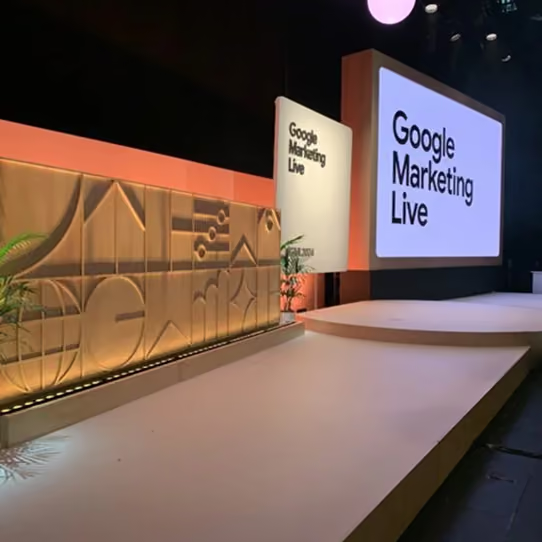
The first thing a set does is tell people where to look. A speaker standing in front of a flat hotel wall has to earn attention through delivery alone, and in a room of three hundred people that's a hard ask. Frame the same speaker with a defined backdrop, a lighting state and a raised deck, and the audience knows within a second where the focus of the room sits.
Sightlines also decide who gets a good experience and who doesn't. Low staging in a flat floored room means anyone beyond about the eighth row spends the session watching the back of somebody's head. Raising the deck by even half a metre changes that, and moving lecterns and screens so they don't sit directly in front of side sections widens the audience that can see comfortably.
Height Changes How An Audience Listens
Stage height changes the relationship between speaker and room. A high stage creates authority and works well for keynotes, awards and anything where the speaker is the expert addressing a crowd. Bring the deck down to a step or two and the same room feels more like a conversation, which suits panels, workshops and internal sessions where you want people to ask questions.
Getting this wrong is noticeable. A managing director delivering a difficult restructure update from two metres above the workforce reads very differently from one doing it at floor level, and neither height is right for every occasion.
Lighting Tells People Where To Look
Lighting is the fastest way to move a room's attention, and it's the element most often left to the venue. House lighting is usually designed to light the whole space evenly, which is the opposite of what a presentation needs. When the audience is lit as brightly as the speaker, people check their phones, talk to each other and drift.
Dropping the audience level and putting a proper key light on the speaker pulls focus without anyone consciously noticing. Colour states do the rest of the work across a day, since a warm wash between sessions and a cooler, brighter state during content give delegates a clear signal about when they're supposed to be paying attention and when they can relax.
Screens Compete With The Speaker
Every screen on a set is asking for attention, and if you give it too much it wins. An oversized LED wall behind a single presenter tends to reduce that presenter to a silhouette, particularly when the content is bright and moving.
The better arrangement keeps the screen large enough for the back row to read a slide, positioned so it doesn't overlap the speaker's position, and dressed into the set so it reads as part of a designed space. Side screens help in wide rooms. So does a holding graphic that goes neutral when there's nothing on the slide, because an audience staring at an old slide for six minutes has stopped listening.
The Room Beyond The Stage
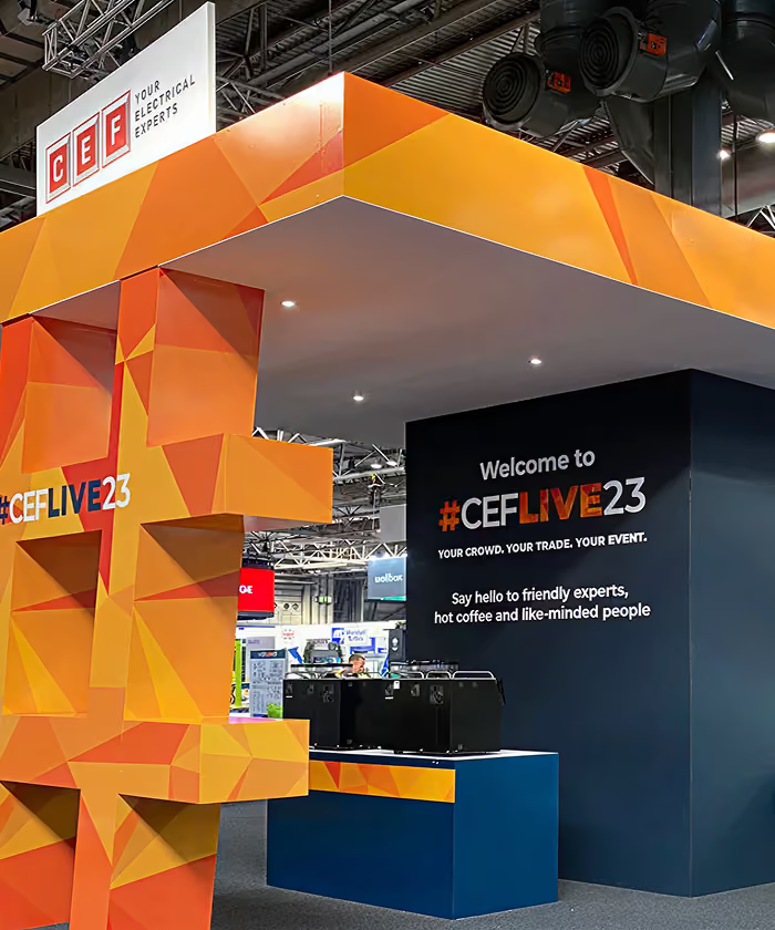
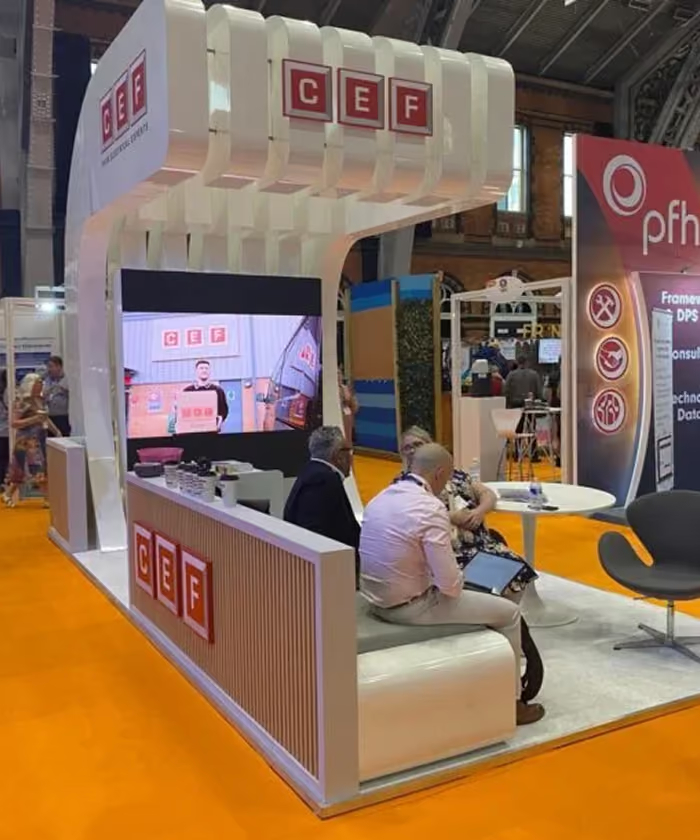
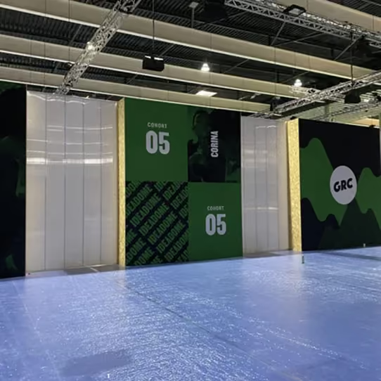
Delegates spend the majority of their day outside the main session, so the set only works if the rest of the space supports it. Branding that continues into the registration area, the catering zone, the breakout rooms and the corridors between them makes the event feel coherent, and it keeps people inside your environment during the parts of the day when conversations and connections actually happen.
Seating layout belongs in this conversation too. Theatre rows suit a keynote, cabaret rounds suit sessions with discussion built in, and choosing the wrong one undermines a set that's otherwise well designed. Plenty of audience-focused stage design starts from the chairs and works backwards towards the deck, because the layout determines what sightlines you're even able to offer.
Designing For Cameras As Well As Chairs
Most conferences now get filmed, streamed or cut into clips afterwards, which adds a second audience with different requirements. Cameras need contrast between the speaker and the background, front lighting bright enough to avoid noise in the picture, and a set that fills the frame without large empty areas.
Designing for both audiences at once takes some negotiation. A backdrop that looks generous in the room can appear sparse on camera, and a lighting state that flatters the stream can leave the live audience sitting in the dark for longer than they'd like. Agreeing the priority early, before the set is drawn, saves a difficult conversation on site.
Where To Start
If you're planning a conference for next year, the useful first step is to walk your venue with someone who builds sets for a living. Ceiling height, rigging points, get in access and the shape of the room will narrow your options quickly, and knowing those limits early means the design you fall in love with is one you can actually install.
IMA Solutions designs, builds and installs conference sets and event staging with our own team, from the first visual through to the on site build. Give us a call with your venue and your dates, and we'll tell you what that room can do.